Keith Shore, an American artist, is best known for his distinct, minimalist style that blends playful color schemes with modern design elements. His artistic approach has left an indelible mark on the world of baseball card design, particularly through his collaborations with Topps on their groundbreaking Project 2020 and Project 70. This article explores Keith Shore’s background, his contributions to these celebrated projects, and his enduring connection to baseball.
Biography: The Artist Behind the Cards
Keith Shore was born and raised in the United States. He grew up in a world where baseball and art often intersected in popular culture. From an early age, Shore displayed an affinity for creative expression, particularly drawing and painting. His formal art education led him to develop a distinct style characterized by bold, flat colors and simple, clean lines. Influenced by artists like Alexander Girard and other mid-century modern designers, Keith Shore’s work often evokes a sense of nostalgia through minimalism, a balance of abstraction, and recognizable, human-like figures.
Shore’s journey into the world of professional art started with freelance illustration work. He gained attention for his album covers, posters, and gallery exhibitions. His style was already well-known within indie and underground art circles. However, his big break into a larger cultural conversation came with his involvement in Topps’ iconic baseball card projects.
Keith Shore’s work is particularly known for being playful yet thoughtful, adding depth and character to even the simplest forms. This made him a perfect fit for a project that demanded a modern take on classic imagery—Topps Project 2020. But beyond these projects, his style fits naturally into baseball’s visual language, capturing the sport’s timeless and universal appeal.
Keith Shore’s Artistic Style: Minimalism with Depth
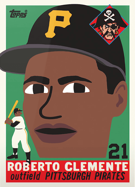
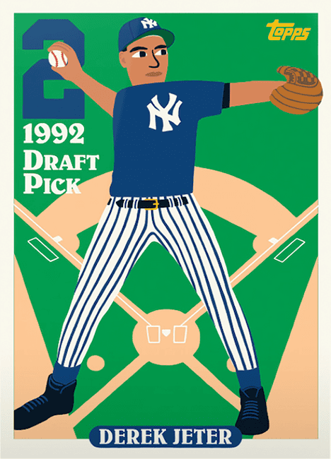
Shore’s artistic style can be described as a fusion of contemporary and nostalgic aesthetics. He often works with flat, vibrant colors and simple geometric shapes, creating art that feels approachable yet sophisticated. His characters are often depicted with large, wide eyes and simplified expressions, yet convey a surprising emotional depth. This style gives his work a universal quality, making it easily recognizable and endearing.
A key aspect of Keith Shore’s style is how he invokes a sense of retro aesthetics without fully committing to them. His work, while minimalist, also references mid-century designs that make it feel timeless. Whether he’s illustrating a children’s book cover or redesigning a baseball card, Shore’s work feels familiar yet modern. It’s something that can be appreciated by both longtime art lovers and those new to his style.
When tasked with redesigning classic baseball cards, Shore’s minimalistic approach didn’t lose the essence of the original. Instead, he highlighted its core attributes in a fresh way. By focusing on primary forms, Shore gives viewers a chance to see these cards in a new light. However, they can still appreciate their historical significance.
Topps Project 2020: Shore’s Fresh Take on Baseball History
One of the most notable contributions from Keith Shore came with his involvement in Topps Project 2020. The project aimed to reinterpret 20 of the most iconic baseball cards ever produced. The project featured 20 artists, each offering their take on these classic cards. Shore, already known for his artistic versatility, was a standout in this project.
Key Contribution
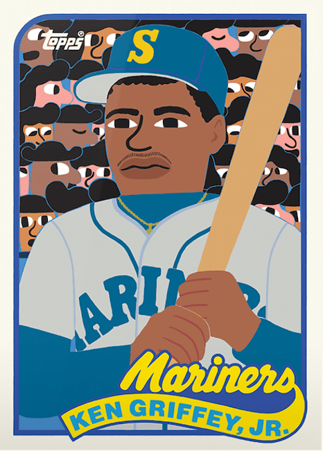
Shore’s most famous card from Project 2020 was his reinterpretation of the 1989 Topps Ken Griffey Jr. rookie card. The card was extremely in-demand and had the highest print run – 99,177 copies – of any Project 2020 card.
Griffey’s rookie card is one of the most iconic in baseball card history. Shore’s version added a bold, colorful twist while maintaining the essence of the original. His use of large, flat areas of color gave the card a modern pop-art aesthetic. However, it was still instantly recognizable as the Griffey rookie.
His design choices not only paid homage to the original, but also reflected his own artistic style. Griffey’s figure was more cartoonish, with exaggerated facial features. The card retained a sense of fun and reverence that resonated with fans. This balance between creativity and respect for the original card is a hallmark of Shore’s work throughout Project 2020.
Shore’s cards often featured abstracted backgrounds, playful reinterpretations of player portraits, and vivid colors. His designs sparked conversation among collectors. Many praised his ability to stay true to the spirit of the original cards while introducing a distinct, modern twist.
Reception and Legacy
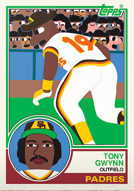
Shore’s contributions to Project 2020 were widely celebrated by both the art and baseball card communities. His unique aesthetic attracted a new generation of collectors who might not have been initially drawn to traditional baseball cards. Meanwhile, longtime collectors appreciated the fresh take on familiar classics, seeing them as both works of art and tributes to the game’s history.
Shore’s Project 2020 cards often sold out quickly, becoming highly sought-after pieces within the collector community. His Griffey card, in particular, became one of the most talked-about pieces in the entire project, with some praising it as one of the defining cards of the set.
The success of Shore’s work in Project 2020 also opened the door for him to further explore baseball-related art, setting the stage for his involvement in Topps Project 70.
Topps Project 70: Expanding the Canvas
Following the success of Project 2020, Topps launched Project 70 in 2021 to celebrate 70 years of Topps baseball cards. This project gave even more creative freedom to artists, who were tasked with reimagining any Topps baseball card from any year. Keith Shore was once again invited to participate, and his contributions to Project 70 further cemented his status as a key figure in the evolving world of baseball card art.
Keith Shore’s Approach to Project 70
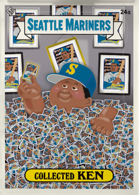
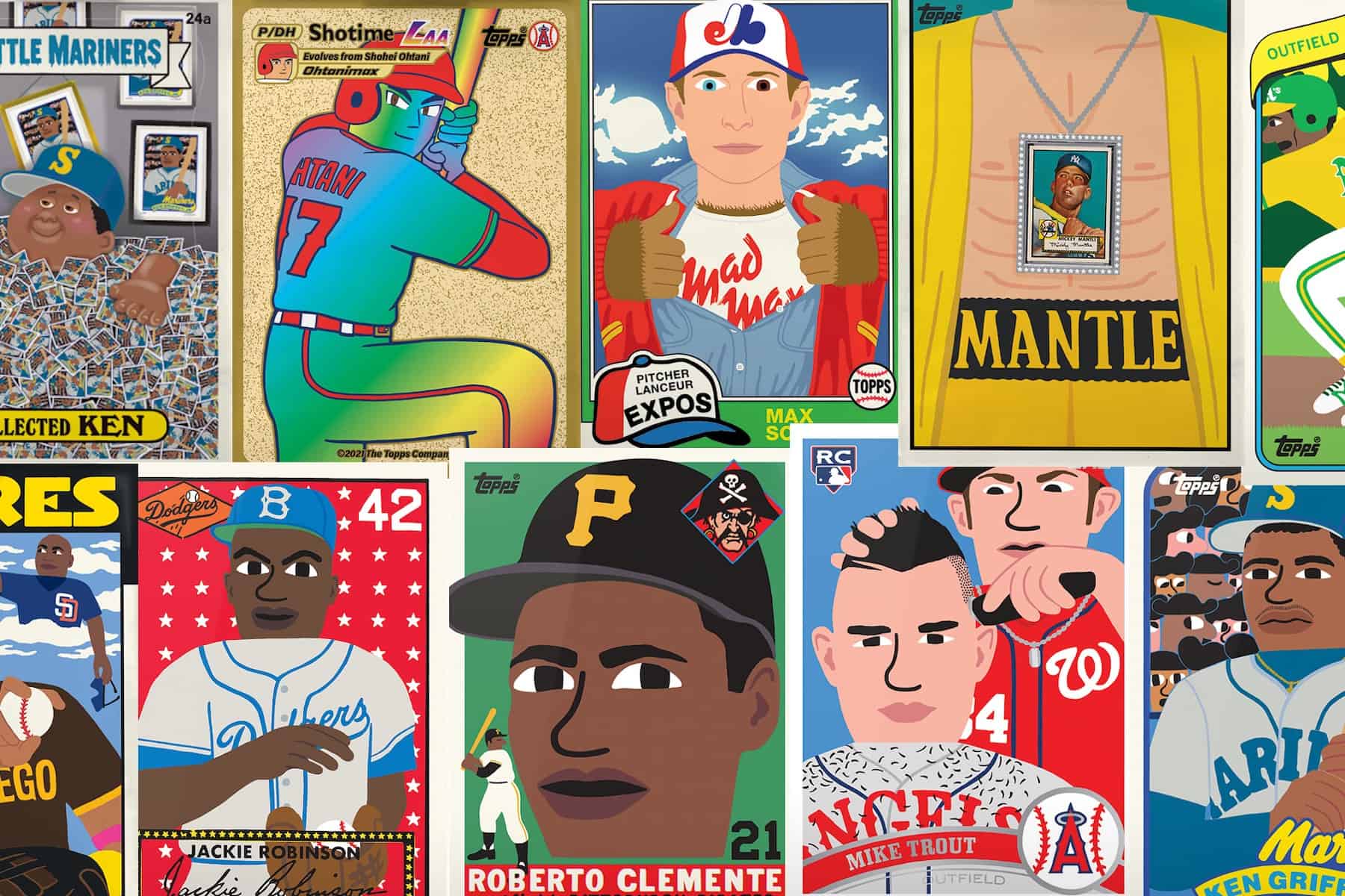
In Project 70, Shore continued to utilize his signature minimalist style, but he also pushed the boundaries of what a baseball card could represent. In many images, he combined the style of the Garbage Pail Kids – for which he’s also an illustrator – and baseball cards. He even came up with playful names to accompany the concepts. With no limitations on which cards or years could be selected, Shore was able to dive into the rich history of Topps baseball cards, selecting designs and players that resonated with him personally.
For example, his reinterpretation of modern players, such as Shohei Ohtani, brought a dynamic and contemporary edge to the project, while still maintaining the same bright, playful aesthetic that characterized his Project 2020 work. In these cards, Shore introduced more experimental color palettes and a looser design language, embracing the full creative freedom that Project 70 allowed.
Expanding His Reach
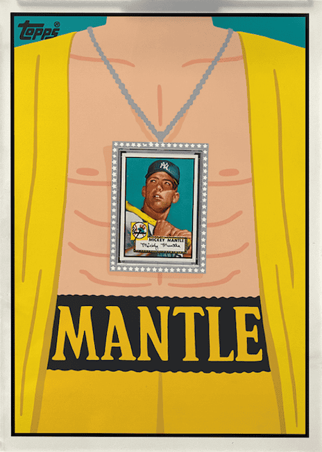
Project 70 also saw Shore experimenting with new themes and ideas within the baseball card format. One card, for example, featured a reimagining of Fernando Tatis Jr. that honored the legendary Tony Gwynn. It showed that baseball is timeless, and these players will inevitably pave the way for others. Fans also took to his interpretation of the 1952 Topps Mickey Mantle #321, which Shore presented as a large, diamond necklace, showing off its value in the hobby.
His work in Project 70, like in Project 2020, emphasized the idea that baseball cards are not just collectibles but also canvases for artistic expression. By pushing the boundaries of design, Shore contributed to a growing movement that sees baseball cards as an intersection of sports, culture, and art.
Keith Shore and Other Baseball Projects
Shore’s involvement in baseball art is not limited to the confines of Topps’ projects. He has become an ambassador of sorts for the blending of baseball and modern art, with his work influencing not only card collectors but also artists and sports fans.

In addition to his work on cards, Shore has created baseball-related artwork for exhibitions, merchandise, and collaborative projects. Notably, he’s created an artist’s series of bats, featuring likenesses of players like Aaron Judge. He’s also been there go-to artist for the MLB Players STEM League board game.
His art continues to bridge the gap between traditional sports memorabilia and contemporary pop culture. As baseball card collecting continues to evolve, artists like Keith Shore are leading the charge in ensuring that the hobby remains fresh, exciting, and relevant to new generations of collectors.
Conclusion: A Lasting Legacy
Keith Shore’s contributions to Topps Project 2020 and Project 70 have changed the landscape of baseball card design. His minimalist, playful approach brought a new energy to some of the sport’s most iconic cards, introducing baseball card collecting to a broader and more diverse audience. Through his work, Shore has shown that baseball cards are not just pieces of memorabilia but works of art, capable of capturing the cultural and historical significance of the sport in new and exciting ways.
As his career continues to evolve, one thing is certain: Keith Shore’s influence on the world of baseball art will be felt for years to come.
